Blue and Mustard Palette
Here's another look at the 2" x 4" painting I just finished.
The bright blue detail is created with such a cool product- it's a stamp designed by my most talented jeweler friend, Patrik Kusek.
I'll have more details on this later, but suffice it to say it's a whole mat of tiny stamps meant for jewelers and others who work in metals and other molding mediums. Of course, I had to take a stab at creating something with paint. I'm loving experimenting with it and will have more paintings as my challenge continues.
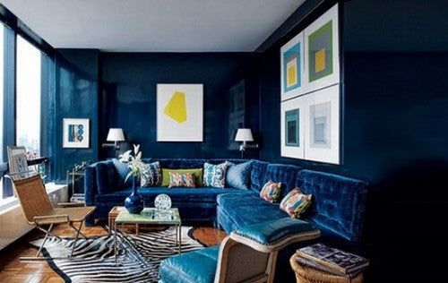
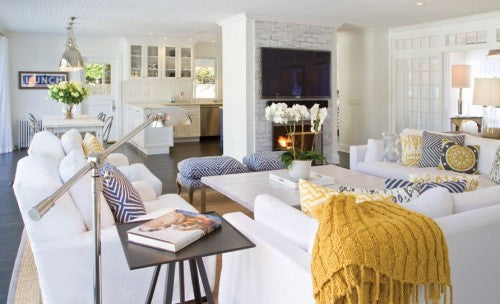
I came up with the color palette as I was working on a brew pub update. The combination of warm, cool, bright and muted creates a rich and balanced feel that could work in almost any space. The bright blue with the active pattern keeps the combination from feeling too heavy and still. Reminds me of one of my favorite rooms designed by Todd Alexander Romano (photographed here for Architectural Digest by Thomas Loof)... I could melt into this room every day after work...


